The homepage of the Moodle sites we work with at Continuing Studies at the University of Victoria utilizes the top “locked” block as the Course Guide, or online syllabus, of the course. As I have worked with this course guide, I have taken it through several iterations.
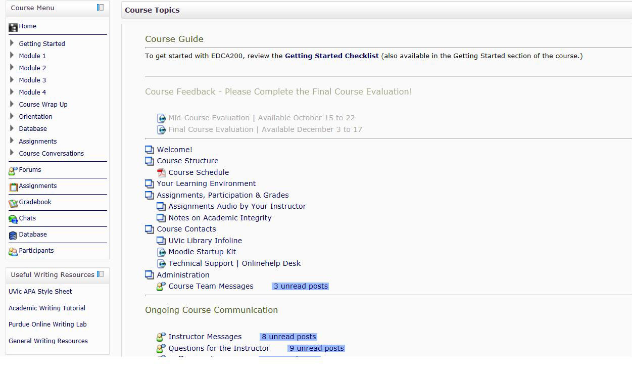
The pages in the initial version contained pages which were very long, with information which was often confusing and hard to read. To solve this problem I broke the content up, so that while there were more pages in the course guide, each page contained less information that I reformatted so it was easier to read. (Click on image to see a full-size version.)
As I worked with this updated course guide block over a few terms, I discovered that the block was slowly becoming quite long, meaning that students had to scroll down everytime they went into the course site to find their content. So I redesigned the course guide again and I moved some of the content into blocks on either side of the homepage. (Click on image to see a full-size version.)
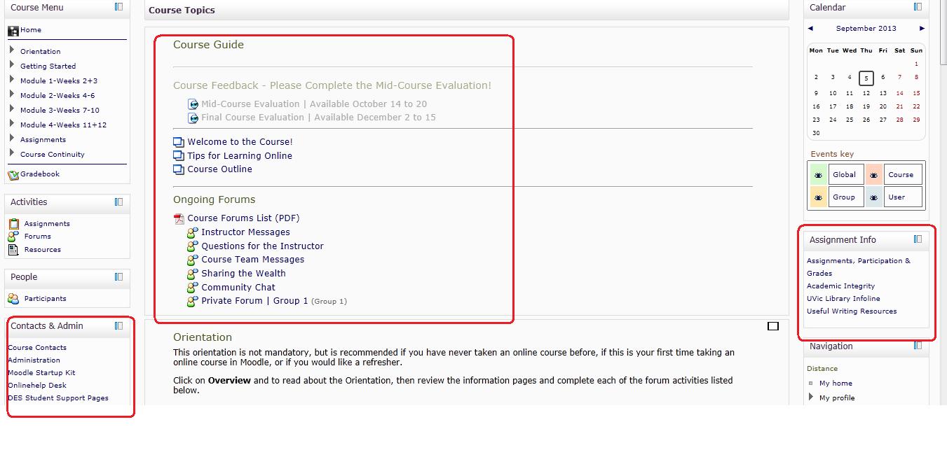
The above iteration is still in pilot mode (it was used for the first time this last summer term, and is being used again for more courses this fall term), and I anticipate that further adjustments will be made to it as we see how students and instructors react to it.
Leave a Reply